
You may be a great designer, but how is your website conversion rate? When it comes to aesthetics of your website you might be tempted to go with your personal preferences, but all major Phoenix web design companies will tell you there’s more to it than meets the eye.
Here is a list of web design hacks that are guaranteed to get you great conversion rates.
Color Combination
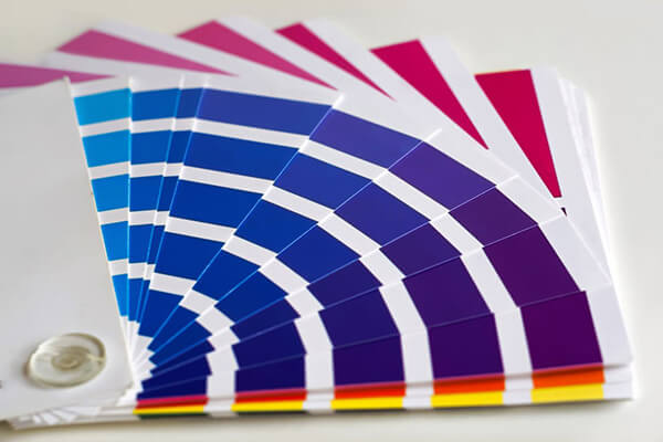 Evaluating a color scheme based on the meaning of the color in relation to the product or service being offered is of vital importance. The color scheme you’ve chosen should trigger the desired response from your viewers.
Choosing the right color palette for your website takes time and skill, as well as in-depth knowledge of the product/service you are marketing.
A good rule of thumb is to never use more than five brand colors. It is ideal for brand colors to be made of a primary color, a secondary color, background color and an accent color. Also, always take note of the color codes you use to avoid inconsistency over time.
Negative Space
The empty space between the elements of your website is known as negative space. When implemented properly, negative space can effectively divert a user’s attention and contribute to a seamless user experience. You will need to factor in both micro and macro negative space when designing your website.
Both line spacing and letter spacing profoundly affect the visual experience of the user. Navigational menus and links should also include micro negative space.
While dealing with macro negative space, make sure there is plentiful space around each block element and around the entire section.
Let there be plenty of space around the call-to-action buttons to make them stand out, and keep the header clutter-free.
Hick’s Law
Hick’s Law states that the more options you present your users with, the longer it will take them to make a decision.
The objective is to try and simplify the decision making process. While consumers these days are used to having endless options at their fingertips, the initial attractiveness of extensive choice isn’t necessarily reflected in subsequent purchasing behavior.
While users spending too little time on your website may be unfavorable, spending too much time may be an indication of users getting caught up in information-overload and failing to make a purchase.
It is imperative to offer the most useful set of options and avoid frustrating the user. It is important to remember that the user’s time is precious and they are not obligated to stay on your site.
A good practice is to categorize the available choices and group similar choices into higher categories. Breaking up long or complex processes into screens with fewer options is also recommended.
Typography
Typography and the fonts you use on your website can have a huge impact on conversion as ultimately all your users rely on text to accomplish whatever they are visiting the site for.
It is recommended to not use any more than 3 font families on your website.
Choose one for headlines and sub headlines and one for body texts and paragraphs. A clean sans-serif font is optimal for screens and hand held devices like phones and tablets. Make sure the font size is not too small to be uncomfortable and not too big to have users scroll or swipe unnecessarily.
Persuasive web design is a delicate art and cannot be implemented overnight. Implementation of the above pointers can get you a step closer to perfection.